

Some basics when creating templates for SmartPhones include:
 Use small, simple logos
- Avoid background graphics.
 The end users ambient light will vary depending on whether they are indoors or outdoors.
- Background graphics can make it impossible for learners to read the screen in some light.
- Minimize the navigation elements.
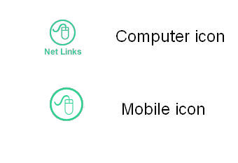
- Graphic navigation icons should be simple and clear.
- Since someone will be touching the graphic with their finger the graphic may be larger then a computer icon.
- Words used for navigation will need to be large enough to be easily touched. If navigation text is too small, then it is hard for the learner to touch the word they want.
- Course that follows W3C recommendations
- Deploy HTML and relative positioning (page resizes based on the screen size).
- Avoid absolute positioning.
- If you are already using a tool, confirm that it works on mobile devices. If the vendor does not claim it works on mobile devices - it does not work on mobile devices.
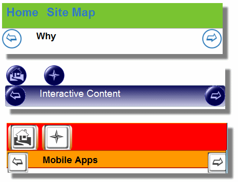
- Layering controls
- How long is your content? Do you need a navigation arrow at the top and bottom of your content?
- What about home, map and other global controls? You will need to decide if you want them at the top or bottom.
- There currently is not a consensus on where controls should reside (top or bottom). Since a home button takes up valuable screen real estate you may want to place it on the bottom of your page.


