

This image shows the same web site displayed in five different mobile browsers.
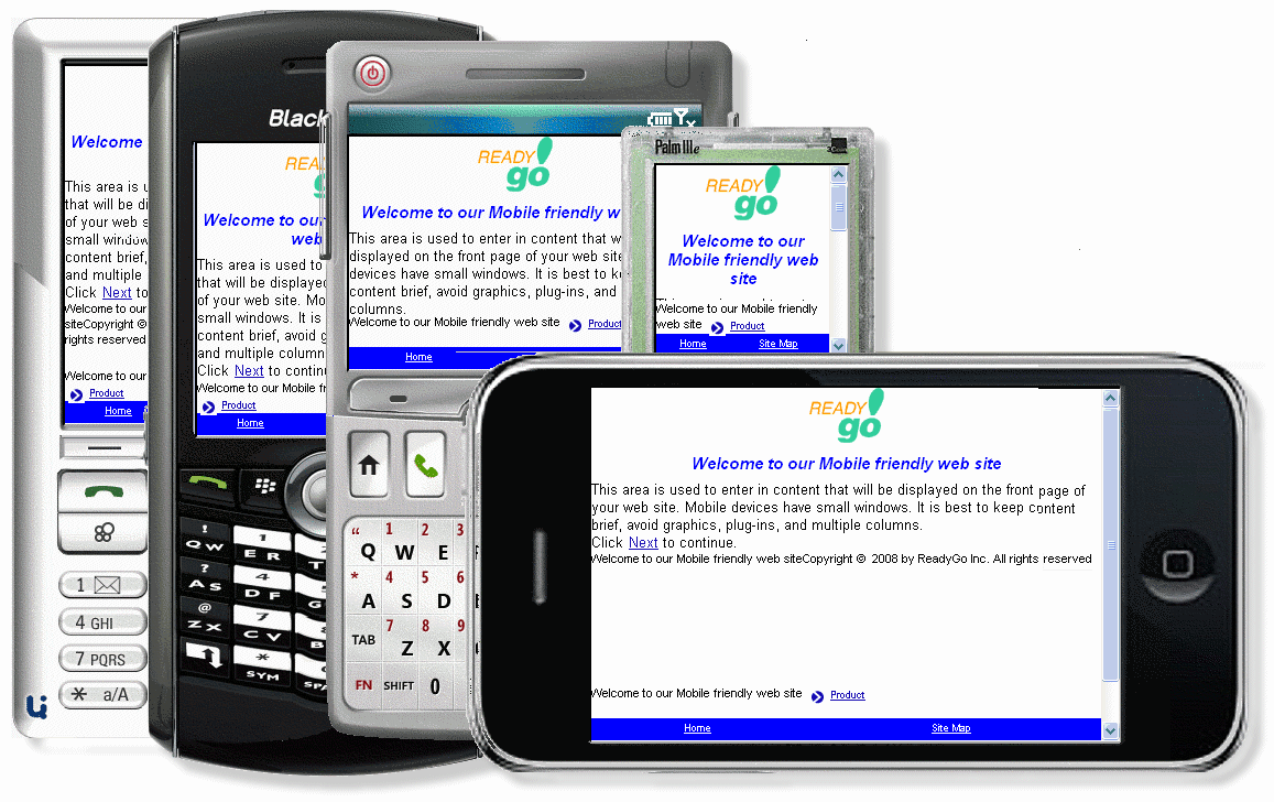
 Some work better than others
- All devices display HTML and graphics
- Some of the devices, like Android and iPhone, automatically assume they are displaying an 800 x 600 screen. To read the screen the visitor must zoom in
- The window size can vary from 320x160 to 600x480, or even landscape mode of 480x600
- Beyond the screen size, there are different levels of support for visual elements such as styles, dynamic content (JavaScript), and images.
 It's True! ReadyGo Mobile is designed to work with all the different mobile devices.
|